
Comments and feedback welcomed and appreciated.
Thank you.

Ready for your call :)
Mon — Fri, 2am — 8pm (EST)
US & EU support teams
We are back in: 1h 20m
Mon — Fri, 2am — 8pm (EST)
US & EU support teams
Apprentice Designer

Posted 23 December 2007 - 02:45 PM
Senior Member

Posted 02 January 2008 - 10:25 PM

Apprentice Designer
Posted 04 January 2008 - 04:11 PM
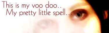
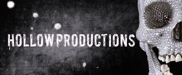
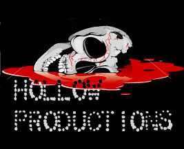
Hey punkerella, some pretty gothic stuff you got there lol. First I think it would help if you provided a brief description as to what these are for..for instance, define what Hollow productions is.
Some advice I could give is to always find what your comfort zone is (wether it be darker type designs or whatever), and then break away entirely from it. As uncomfortable as it may be at first, it'll pay off in the long run.
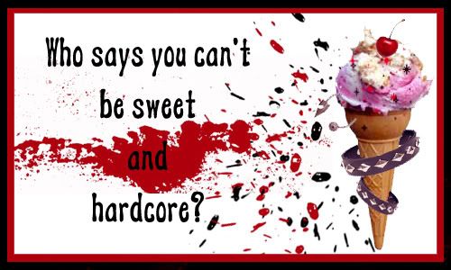
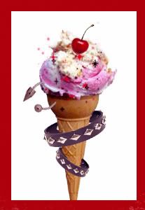
Conceptually, I'm liking were you're going with the ice cream. An option I would try is to leave the ice cream alone, and show a soft (possibly a little girl's hand) holding it. All while wearing the hardcore jewelery, such as the spiked bracelet or rings, etc. I think visually the juxtaposition alone would make for a nice ironic metaphor.
Just an Idea...and always give attention to text, the same way you would imagery. Typography is your images' friend. Good luck, and can't wait to see more.
I am trying so hard to break away from this safety net Ive got going. I piddled around with new contests on here but didnt get much feedback on a non gothic type of style. Ive been trying to touch things that I wouldn't normally touch. I should have more stuff up soon. Apprentice Designer

Posted 04 January 2008 - 09:02 PM
Apprentice Designer
Posted 04 January 2008 - 09:46 PM
I like your designs, you are a talented artist.
My only suggestion would be to try redrawing the icecream in a vector/illustrated looking format. I like the concept, but I think it would work better as a drawing rather then a photo.


0 members, 0 guests, 0 anonymous users
