Jump to content

  • Free consultations and support
  • Live chatClick Here for Live Chat
  • Call ico 1888-906-1888
    Phone support: Open

    Ready for your call :)

    Our business hours:

    Mon — Fri, 2am — 8pm (EST)

    US & EU support teams

    Phone support: Closed

    We are back in: 1h 20m

    Our business hours:

    Mon — Fri, 2am — 8pm (EST)

    US & EU support teams


website template


  • Please log in to reply
&nsbp;

#1 rinaldidesigns

rinaldidesigns

    Elite Designer

  • Designer
  • 2258 posts

Posted 09 May 2007 - 01:45 AM

Posted Imageok....my weakness....I don't do websites...the company asked me after design of logo, labels, vibe...to do a template, complete freedom, no worry about coding.......here is the start....for me because of the cause, this is really, really important I NAIL it;) This is initial concept...fine tuning to be done (esp.cork...hey, its been awhile, since photoshop;))
honest opinions, and the vibe you get.....:D
and option 2...

Posted Image

#2 mattddesign

mattddesign

    Apprentice Designer

  • Designer
  • 80 posts

Posted 09 May 2007 - 02:17 AM

I like the top one the, best. They are both very simple. The one thing that bothers me is that the title at the top seems so seperated form the page andn information. There is nothing connecting it to the page.

Good colors.

mattddesign

#3 apresico

apresico

    Guru

  • Designer
  • 1210 posts

Posted 09 May 2007 - 03:37 PM

it looks good but I think there needs to be more graphics. Maybe something with wine and one of those pink breast cancer ribbons at the edge of the paper hanging outside of it may look nice. I also prefer the top design, but I think the navigation would look better somewhere at the top because thats what should be standing out. In this effect the bottom one is good, but I think the drop shadow on the edge of it looks a little out of place. Maybe if that edge was sent behind and and the links pushed to the left a bit it would look nicer. :) 
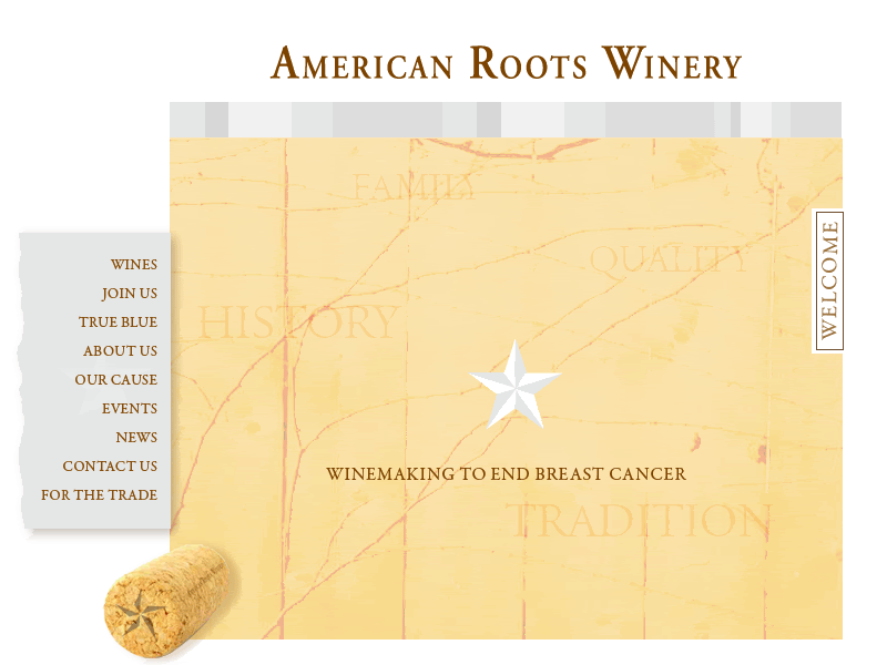
Another this is, will the text for the subpages be on the map? Maybe for a subpage you could make the map more like a banner and have a nice white page for when text needs to be added, if not what you have done is fine because you could have an iframe as well. I like the design, but it needs more graphics to make it a nice web design.

#4 rinaldidesigns

rinaldidesigns

    Elite Designer

  • Designer
  • 2258 posts

Posted 09 May 2007 - 09:41 PM

Thanks for feed back everyone.......the image in the background are vines.....the words, family, giving, are what the client stands for, I wanted to incorporate somehow.....the client likes clean design...thats why I didn't want the typical bottle. glasses.....I wanted it to have a hip, artistic, contemporary feel....the client likes...working on revisions....again, I appreciate feed back, its my first template......:)

Posted Image

#5 mattddesign

mattddesign

    Apprentice Designer

  • Designer
  • 80 posts

Posted 10 May 2007 - 02:21 AM

Great cant wait to see revisions.

I didnt even notice they were vines in the back ground, i thought it was a map or something of that sort.

mattddesign

#6 harrisp9

harrisp9

    Apprentice Designer

  • Designer
  • 54 posts

Posted 13 May 2007 - 10:31 PM

Yeah I'm with matt, I thought the vines were some type of trail, but either way great design!


1 user(s) are reading this topic

0 members, 1 guests, 0 anonymous users