

Logo I designed
I designed three logo concepts for a client. I'm not so sure I'm in love with any of them, so...
&nsbp;
#2

Chung Dha
-

- Designer
- 1439 posts
Guru
Posted 23 December 2007 - 06:42 PM
First bottom I see around the figure a odd outline like it was cut out of a pictures. Instead of really made by you cause the white outline got a dirty extra edge.
The figures are bit more about save the word or something. Also colors are not really a serious for a counsil. 2nd one is bit clipart like.
And the text could be placed better on all of them. And use full captical and serif less font. Mainly serif font are bit outdated and look old instead of serious.
Main point non of them look very professional. But how the text is placed on the bottom looks good. The words action council may be placed more vertically centered of the dark rectangle. You should do some research what that company does to get more of a idea for a illustration for the logo or get inspired looking at existing logo's but not copy them.
#3
krissoleil
-

- Designer
- 40 posts
Apprentice Designer
Posted 23 December 2007 - 08:23 PM
Thank you, Chung dha!
One of the reasons that bottom one has that garbally look is because I created it Photoshop, brought it to Illustrator make it vector (which was used in the first logo), then saved as an eps and brought it BACK into Photoshop to stretch it and play with it, then back into Illustrator. I think that was more steps than I should have done but I'm not all too great in Illustrator to do it all there.
Ahhh you're right about the second one. Actually, I can't say I'm happy with any of them either. Logos aren't my forte, that's for sure. But I'm trying!
I think my main struggle was fitting the acronym and the full name in one logo. And then those people... I used a generic person stamp in Photoshop and stretched and played with it.
Thanks again - you gave me lots to think about! I'm going to try and come up with some more.
#5
Chung Dha
-
- Designer
- 1439 posts
Guru
Posted 23 December 2007 - 10:42 PM
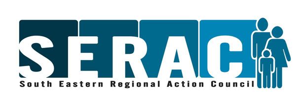
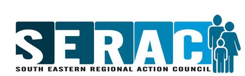
Its much better. Maybe each letter a own box and use full cap words on the bottom. The head of the kid should go up a bit cause it looks like it is sinked between the shoulder.
#8
Chung Dha
-
- Designer
- 1439 posts
Guru
Posted 24 December 2007 - 12:46 PM
Looks much better now change the big initials on the bottom to be same size of rest of the words. That would make it much better and cleaner to watch.
#10
Chung Dha
-
- Designer
- 1439 posts
Guru
Posted 24 December 2007 - 08:03 PM
Yes it improved allot.Here there are allot of good designers always ready to help new designers to improve so later they could also join the Design team. Looking at the fast improvement you be a good designer in no time. Here is a good link you might be interested in http://www.logoloung...p?ArticleID=540
It show logo trend, this help to get inpired to design a logo in certain ways.
It show logo trend, this help to get inpired to design a logo in certain ways.

#13
krissoleil
-
- Designer
- 40 posts
Apprentice Designer
Posted 03 January 2008 - 01:18 AM
Wow, you've definitely made improvements and you take advice very well. I love the change of colors to the blue. Wasn't too thrilled with the purple and yellow ones. Keep it up, it's great to see people improve.
Thank you, Sevenlee!
Yeah, I honestly wasn't crazy about them myself...which was one of the reasons I came across this site and joined! I am finding everyone to be quite helpful and I've been learning a lot.
Thanks for the compliments, you are so sweet!
Oh and to update -- my client loved this one too! I only had to make one small change -- make the characters unisex.
Eventually I'll be brave enough to try one of the projects on here that we can all join in. I dabbled with the Wacom one but couldn't come up with anything impressive enough to show but reading through the posts really do help me to think more about what I'm trying to do.
#14
~V~
-

- Designer
- 96 posts
Apprentice Designer
Posted 07 January 2008 - 05:43 AM
Eventually I'll be brave enough to try one of the projects on here that we can all join in. I dabbled with the Wacom one but couldn't come up with anything impressive enough to show but reading through the posts really do help me to think more about what I'm trying to do.
Considering the way you took on the advice of others for your design of the serac logo I think you should give yourself more credit. If you tried in the contest you could've gotten a lot of good feedback and made a really great entry. Don't worry about your work having to be really impressive or anything, this is a good place to get feedback and advice to help you grow and improve. You shouldn't be shy, I haven't been here very long but generally the DC community is friendly and willing to help.

#15
krissoleil
-
- Designer
- 40 posts
Apprentice Designer
Posted 07 January 2008 - 07:54 AM
Considering the way you took on the advice of others for your design of the serac logo I think you should give yourself more credit. If you tried in the contest you could've gotten a lot of good feedback and made a really great entry. Don't worry about your work having to be really impressive or anything, this is a good place to get feedback and advice to help you grow and improve. You shouldn't be shy, I haven't been here very long but generally the DC community is friendly and willing to help.
Wow, ~V~! Thanks for the boost of confidence!
I know I definitely am learning a lot just by being a part of this community so I'm definitely going to try to come out of my shell a bit more and join in on the community contests.
Sometimes I feel like I don't qualify to call myself a "graphic designer" because I really haven't any formal training. Kinda like how Rachael Ray refuses to call herself a chef
 I feel like I don't deserve that title. I know I have a long way to go, but gosh...for people to say I actually just might have some potential - that really means a lot! Thank you!


2 user(s) are reading this topic
0 members, 2 guests, 0 anonymous users
